GRAPH DISCLAIMER!!!
None of these graph's will directly relate to the topic of Lupus. They can tie in though.
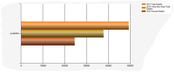
Graph captured by: Grace G
This graph shows the total number of Death's in 2012 in the state of Alabama. It also shows the death number of whites and the total number of female deaths. All of this is based for 2012.
|
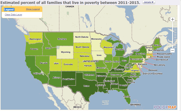
Graph captured by: Yaa Q.
This graph shows percentages of families than lived in poverty in 2011-2015. Major of the big states are shaded in dark green while there are many little states shaded in green that are in great poverty. Healthy Food Access Portal(ND). Research your Community http://healthyfoodaccess.org/get-started/research-your-community * When on the site, hover mouse on PEOPLE and then click FAMILIES IN POVERTY. * |
Captured by: Omari J
